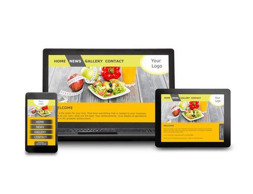
You might say to yourself, “Most of my customers aren’t looking at my site from mobile phones.” Recent studies have shown that more than half of digital traffic online now comes from mobile devices. This is going to give and take depending on your industry, but on average, our clients are seeing anywhere from 25-60% of their website traffic coming through mobile. Even at it’s lowest, is 25% a figure that you’re comfortable neglecting? Combine this with the fact that neglecting to have a website that is up to the current “web standards” will also negatively impact your overall success in search engines. We would say that NOW is the time to start getting serious about this once “optional” web design move. Here are five more reasons that illustrate the importance of mobile optimized websites.
1. Mobile Users are Different
Mobile users have different objectives than desktop users and typically this means they want information in quick, easily digestible bites. Customers report that their mobile purchases are often impulse buys and some statistics show that mobile users spend more money per purchase than customers do on desktop websites.
This underscores the importance of optimizing your mobile experience to match a visitor’s needs and behaviors in the context of how they will most likely be browsing your website. By making the path to purchase or enquiry simple and intuitive you’ll align more precisely with mobile users who need information rapidly to make decisions on the fly.
 2. Mobile Gets Traffic
With one-quarter of global web searches conducted on a mobile device by over a billion users worldwide, mobile websites are just as important, if not more so, than desktop versions. Multiple sources report that smartphone users are engaging with mobile websites and apps while watching TV, commuting to work, and simultaneously while using a computer.
As Google made clear with last year’s Hummingbird update the future of search is mobile and websites that aren’t usable on handheld devices will see their search rank suffer for it.
3. Better Brand Engagement
People like your brand more when you offer a satisfying mobile experience and they’re more likely to return to your website later on a desktop. 90 percent of people report moving between devices, or “multi-screening”, to accomplish a task. When your mobile experience is optimized for functionality and consistency it fosters trust and affinity with users.
On the other hand if your mobile website is difficult to navigate customers are more likely to go to the competition than to visit you on a desktop computer. If you can’t provide what they need when they need it you will have lost the opportunity for the sale and risk losing a customer permanently to a competitor.
4. Increased Conversions
Desktop websites in mobile browsers are ineffective at converting visitors into buyers. Calls to action (CTAs) are often obscured, links are difficult to click and contact pages are buried in awkward menus. Mobile shoppers have little patience for an unwieldy website and one-third of them will leave a transaction if the site isn’t optimized for mobile.
To make the most of mobile, CTAs should be clear and easy to click and contact information should be one of the first things visitors see. 80 percent of shoppers admit that mobile purchases are impulse-driven and that they’re more likely to purchase from and interact with a brand that offers an engaging mobile experience.
5. Reduce Your Bounce Rate
Content that looks great on a desktop might be unreadable on a mobile device. Visitors won’t stay on your site if they have to pinch and zoom or squint at illegible type, or worse yet if it runs flash or anything that requires add-ons to display in a browser. If your website isn’t optimized professionally for mobile your bounce rate on mobile devices is going to be extremely high. By providing mobile visitors with an appropriate and intuitive user experience you will obviously engage visitors longer and drive more of them to purchase or enquire.
Mobile Health Check: Pick up your smartphone and go to your website. Ask yourself these questions:
• Does it load in less than three seconds?
• Does it draw your eye to your key selling points or message?
• Is the content easy to read?
• Is it easy to navigate?
• Is it easy to recognize and activate the call to action?
• Does it provide a good user experience?
• Is it a website you would spend time if it was not your own?
If you mostly answered “no”, then it’s time to update your website and capture the traffic and sales you’ve been missing out on.
Hopefully, you are now clear on the importance of mobile optimized websites. Creative Juices Marketing is highly informed of the most effective and efficient ways to build websites. Give us a call to talk to us about how we can create or update your business’s website. 434 964 7511 or CONTACT US.
See also Top Website Trends 2021 and Why You Need A Responsive Website